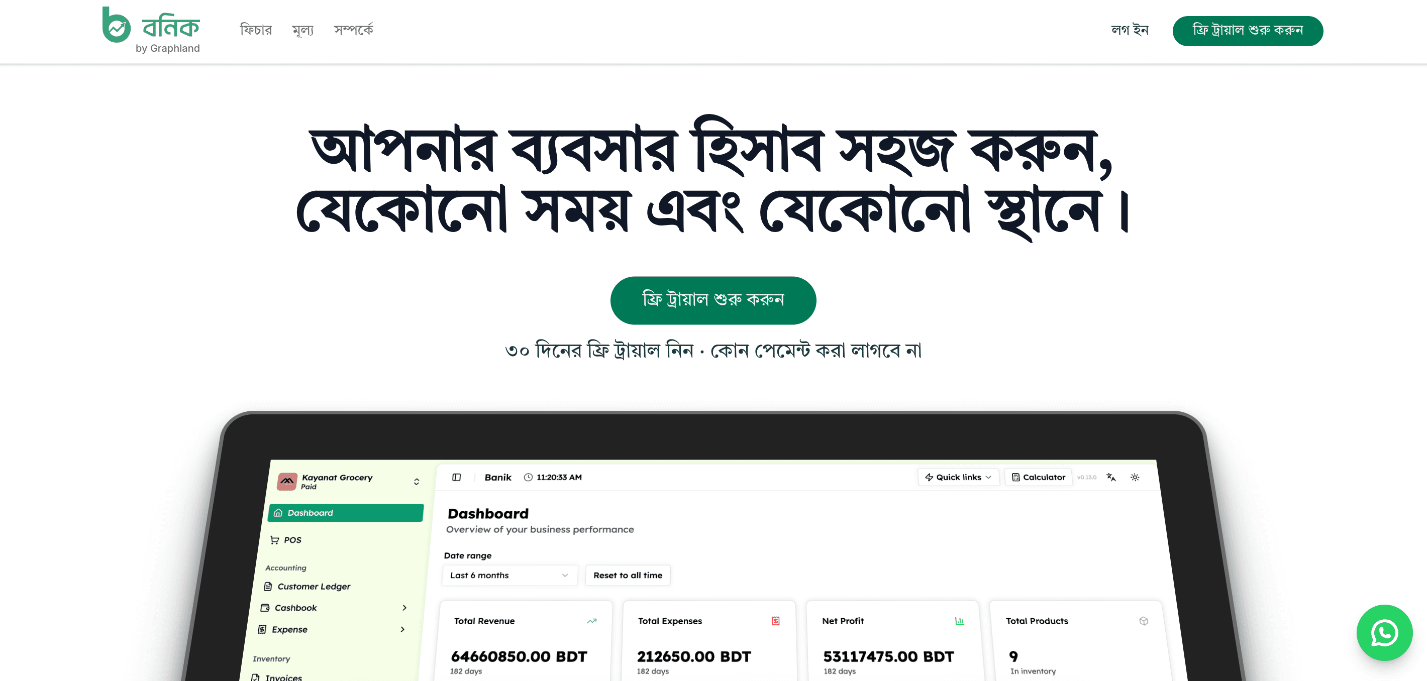
The problem
Banik is an ERP and POS web app for merchants in Bangladesh — point of sale, inventory, invoices, quotations, returns, purchases, customer and supplier ledgers, cashbook, expenses, and payroll, all in one place. By the time I joined, the product already worked. The problem was that it didn't feel like one product: screens had grown independently over time, so the same kind of data — a ledger, a report, a form — could look and behave differently depending on which part of the app you were in. My job was to redesign the whole thing: a new layout and a consistent look for every screen shown here.
Starting from the information, not the pixels
A redesign like this fails if it starts with color and spacing. Before touching any visuals, I went through Banik's actual usage patterns: a shopkeeper opens the app to ring up a sale, an accountant opens it to reconcile a ledger, an owner opens it to check whether this month was better than last month. Those are three different mental models living in one app, and the old UI treated them the same way. The redesign started by defining a shared layout shell — navigation, page headers, and a consistent "totals bar" pattern — so that no matter which of those three people opened Banik, the page told them where they were and what mattered most, immediately.
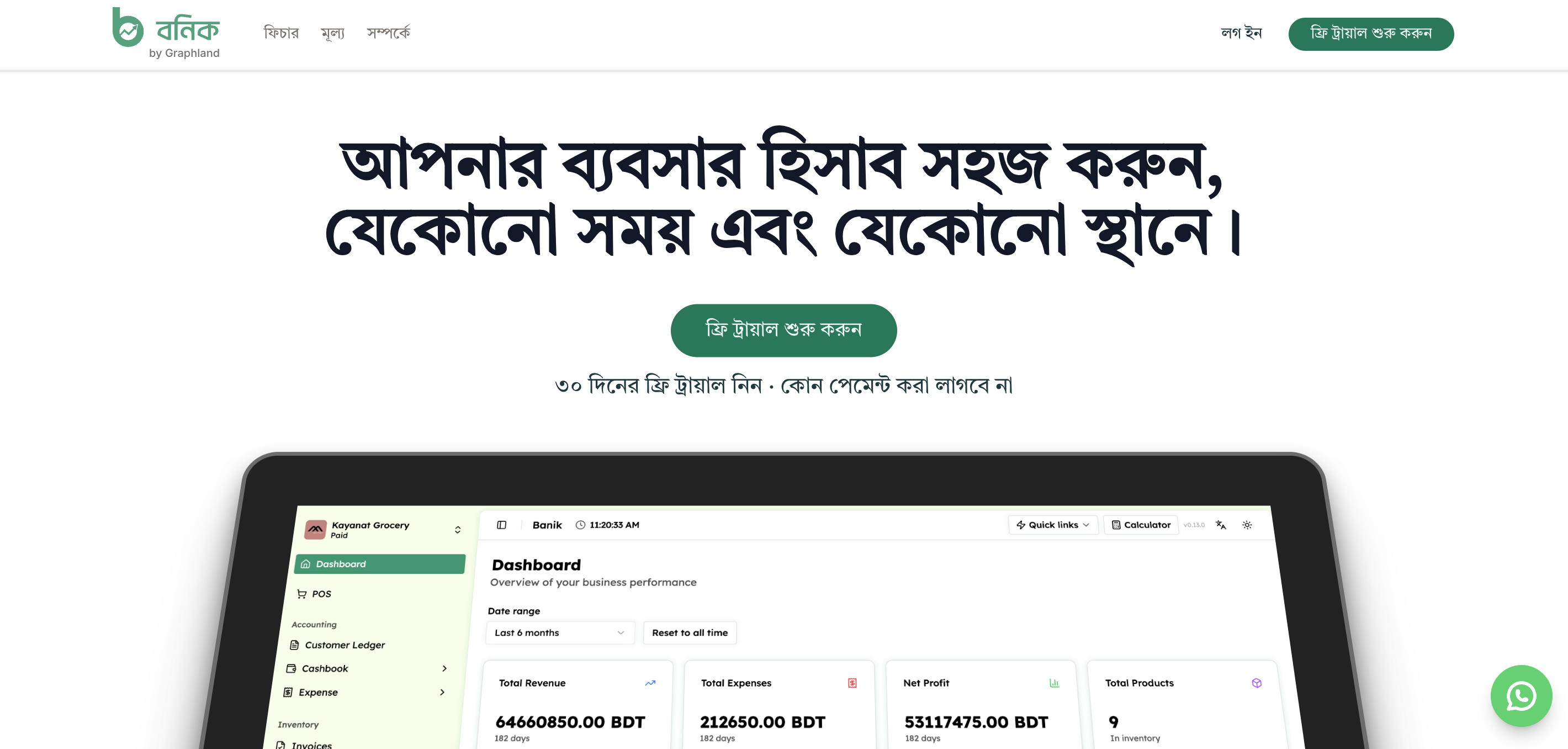 The landing page, in Bengali, offering a 30-day free trial with no payment required — Banik's primary audience isn't comfortable assuming an English-only tool is for them.
Redesigning the core workflows
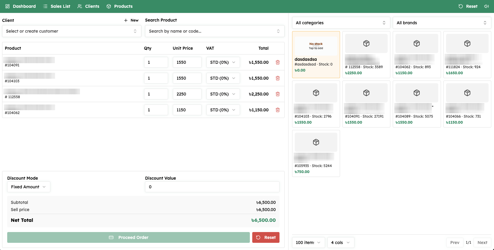
Point of sale. This is the highest-frequency screen in the app, used dozens of times a day by a cashier standing at a counter, not sitting at a desk. Speed mattered more than density here: pick a customer, add products by name or code, set quantity, price, and VAT, apply a discount, place the order — with a product grid on the right that filters by category and brand and shows live stock. Every extra click on this screen has a real cost multiplied across a merchant's whole day, so the redesign prioritized keeping the cashier's hands near the keyboard and the product grid close to the cart.
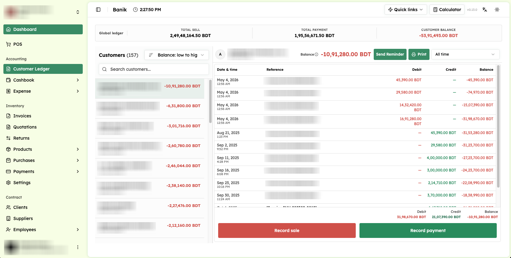
Ledgers. Customer and supplier ledgers are where trust lives in a merchant's relationship with their business partners — get the running balance wrong, visually or in fact, and the whole app loses credibility. I redesigned the ledger around a totals bar (sales, payments, outstanding balance across all customers) sitting above a per-customer running history of debits, credits, and balance, with a sale or payment recordable in one click from the same view.
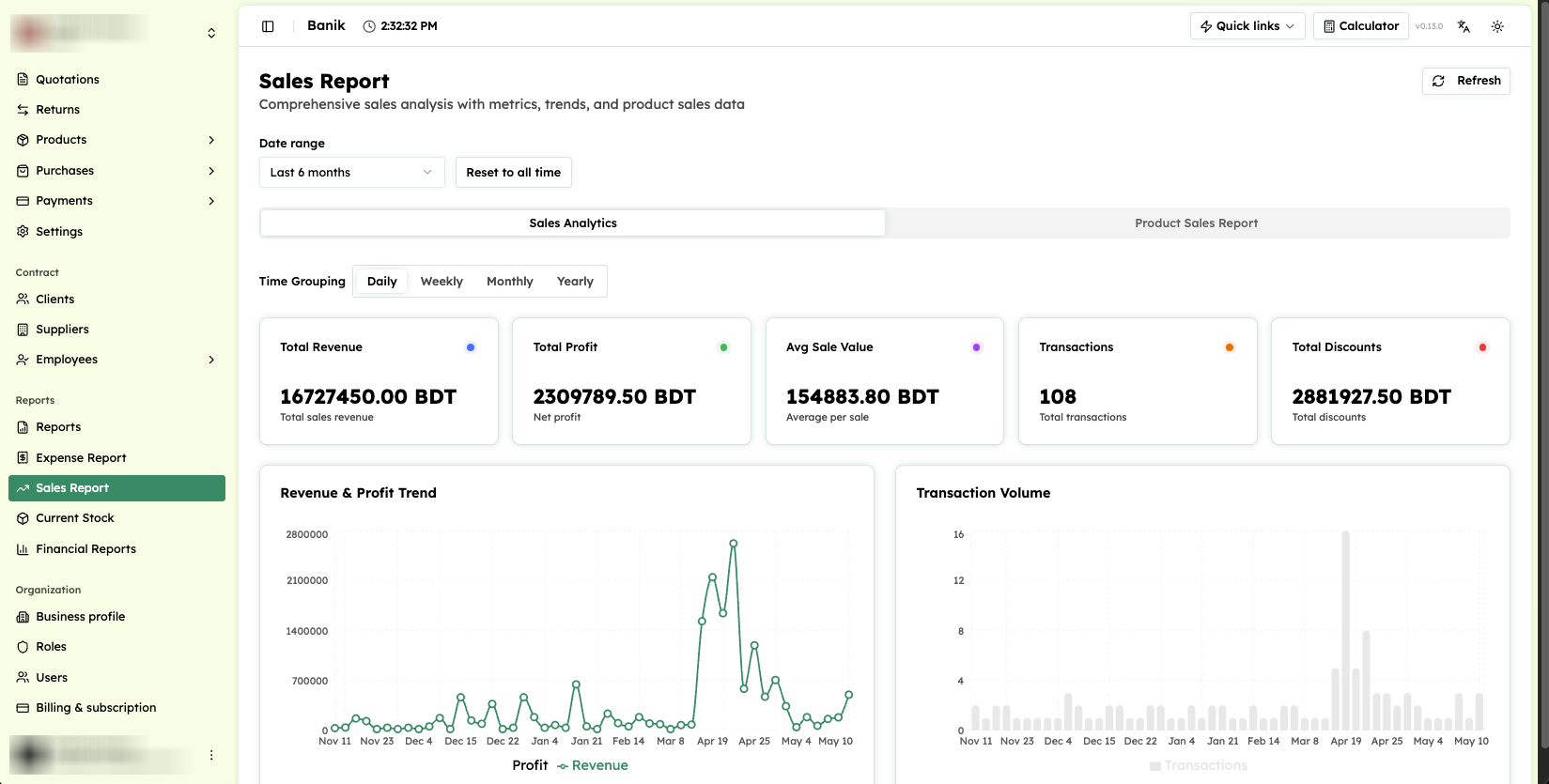
Reports. Owners don't read reports the way accountants do — they want revenue, profit, average sale value, transaction count, and discounts at a glance, with the ability to zoom into day, week, month, or year without leaving the page. I designed the report screen around that zoom-in behavior rather than treating each time grouping as a separate report.
Reminders, exports, and the parts people don't notice until they're wrong
Two screens got a disproportionate amount of redesign attention relative to how often they're opened, because getting them wrong has outsized consequences.
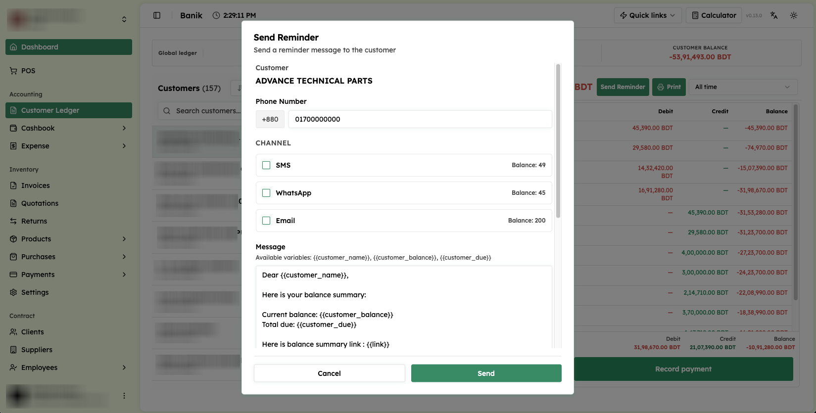
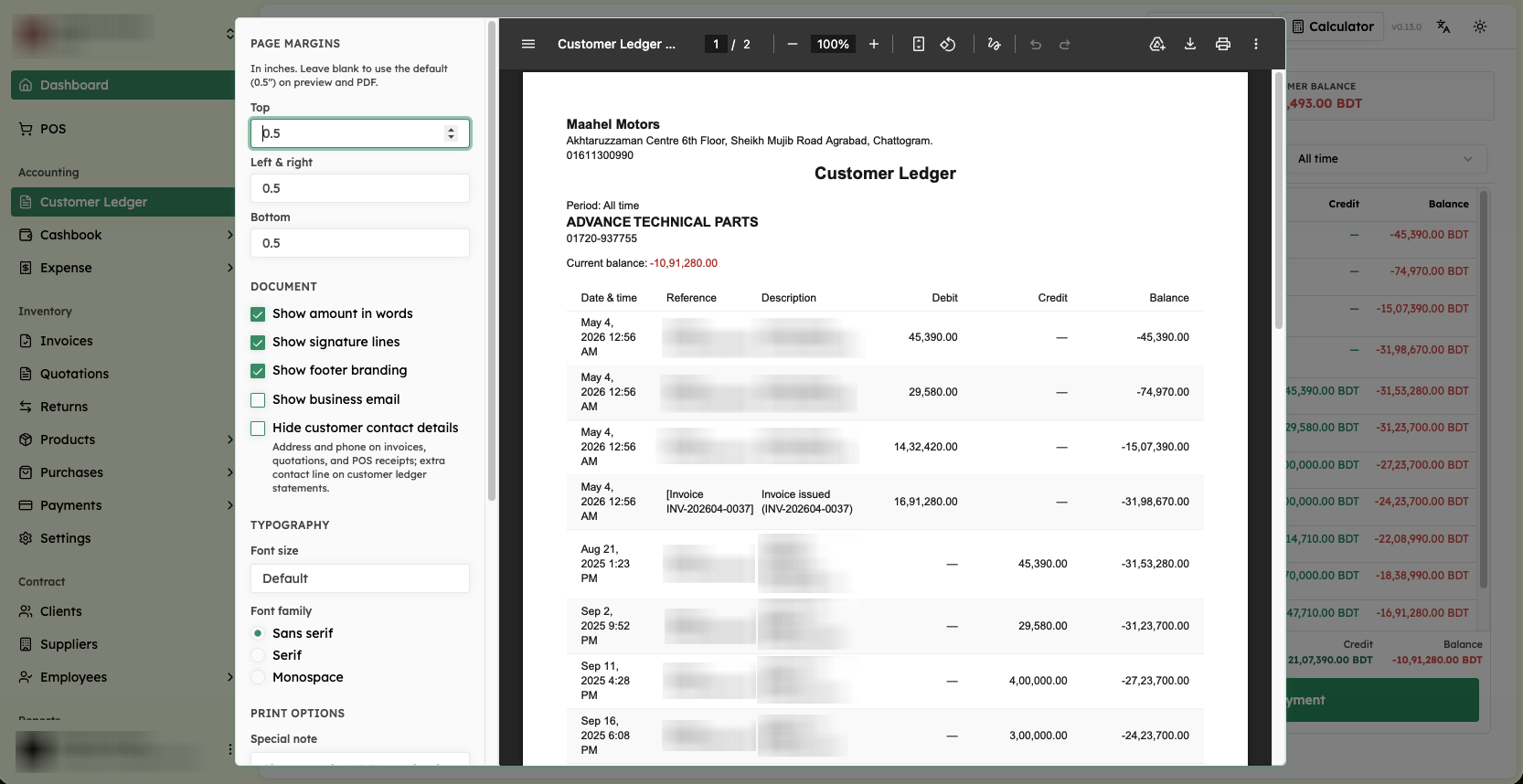
Payment reminders — sent by SMS, WhatsApp, or email from a template with variables for the customer's name, balance, amount due, and a link — needed to feel personal rather than like a generic collections notice, since these go out to real customers merchants want to keep. And PDF ledger exports needed enough control (margins, fonts, whether to show amounts in words, signature lines, branding, contact details) that a merchant could hand a printed statement to a customer or auditor without it looking like a raw data dump.
Roles, permissions, and HR
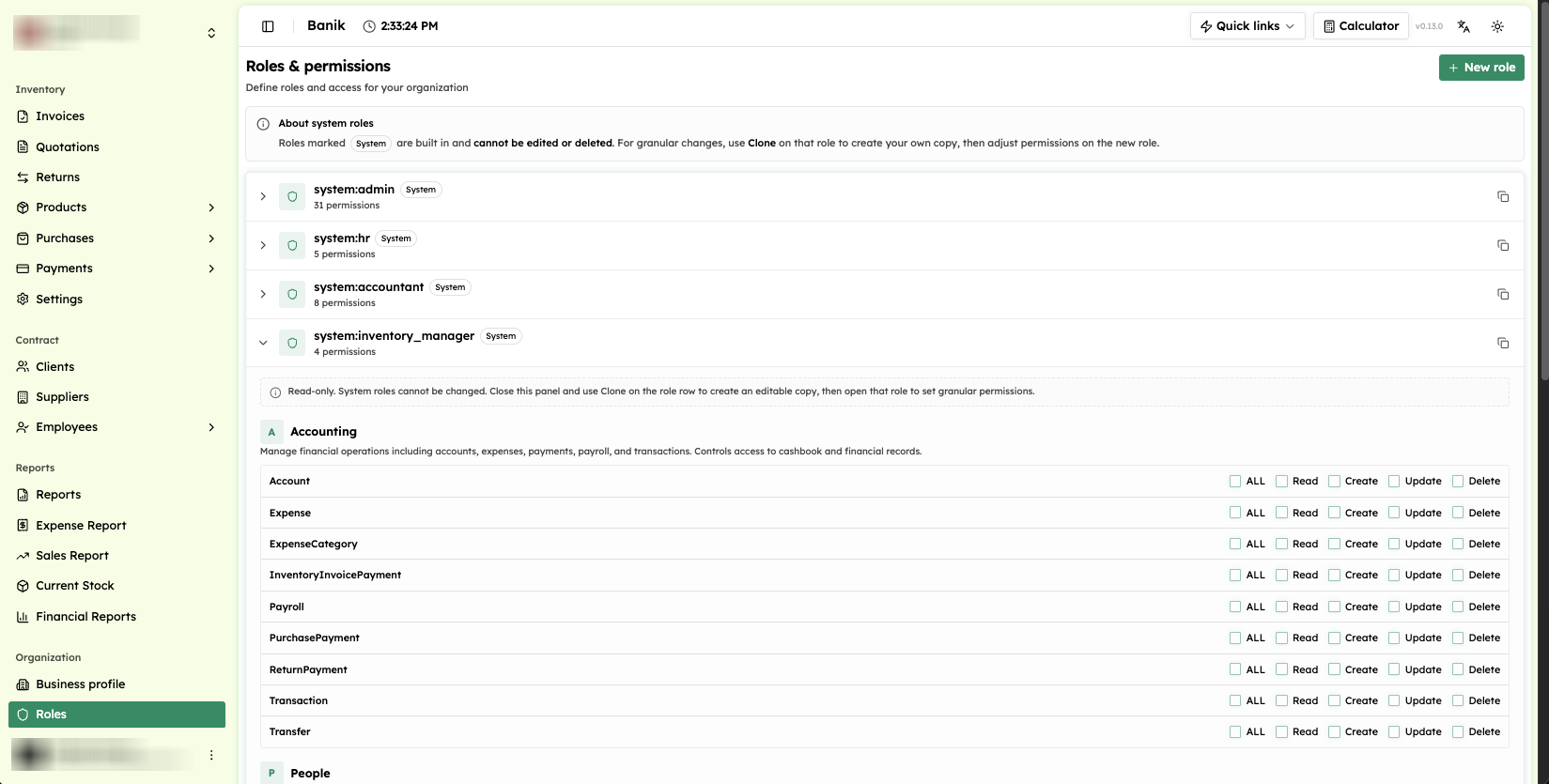
Banik's access model needed to support real organizational structure: built-in roles for admin, HR, accountant, and inventory manager are read-only, and owners clone one into a custom role before setting read, create, update, and delete access per resource. I redesigned this as an explicit permission matrix rather than a settings form, so an owner can see the shape of who-can-do-what at a glance instead of clicking through each role separately.
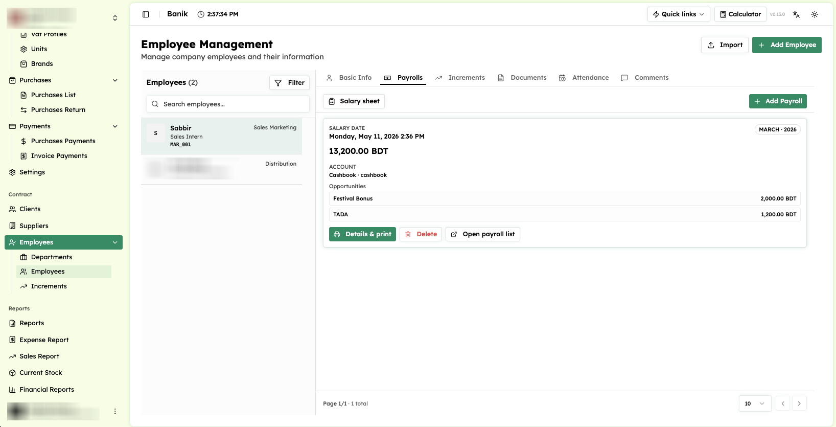 Employee management — basic info, payroll, increments, documents, attendance, and comments — with payroll entries that record the salary month, the paying account, and extras like a festival bonus, a detail specific enough to the local market that it couldn't be an afterthought.
What I'd do differently
The redesign unified the visual language across screens, but some of the oldest workflows — payroll increments in particular — still carry structural assumptions from before the redesign that a purely visual pass couldn't fix. If I revisited this, I'd push for a second pass that reworks the underlying data entry flow for those screens, not just their layout.